Medical website redesign


How can make a medical website more user-friendly and easy to understand?
Challenge—
The old website was loaded with medical terminology and technical language on treatments. The expertise of the team was clear, but not presented in a way that non-medical professionals (potential patients) could understand. The navigation was laid out in a way that made it difficult to reach the intended location. Users struggled to find the information they were looking for and understand what problems Yoo Direct Health could help them solve.
Solution—
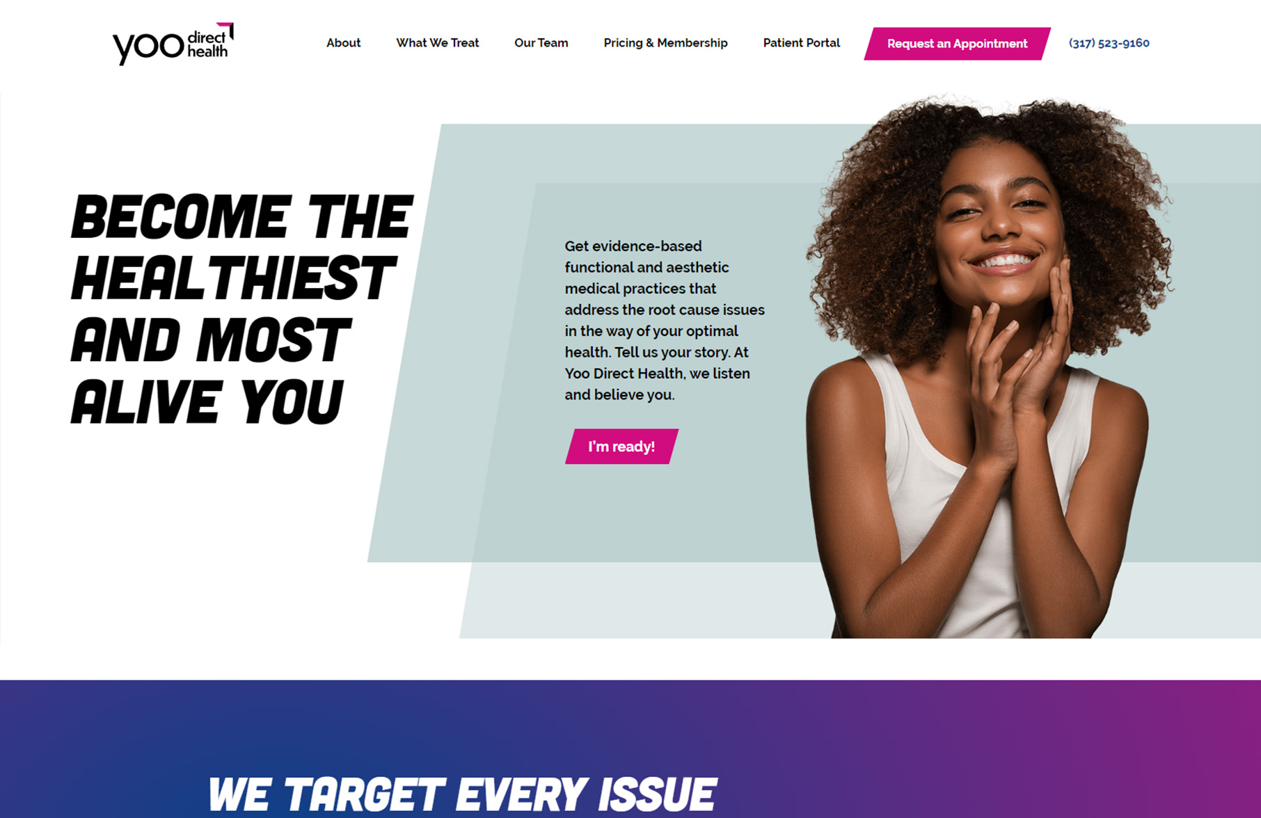
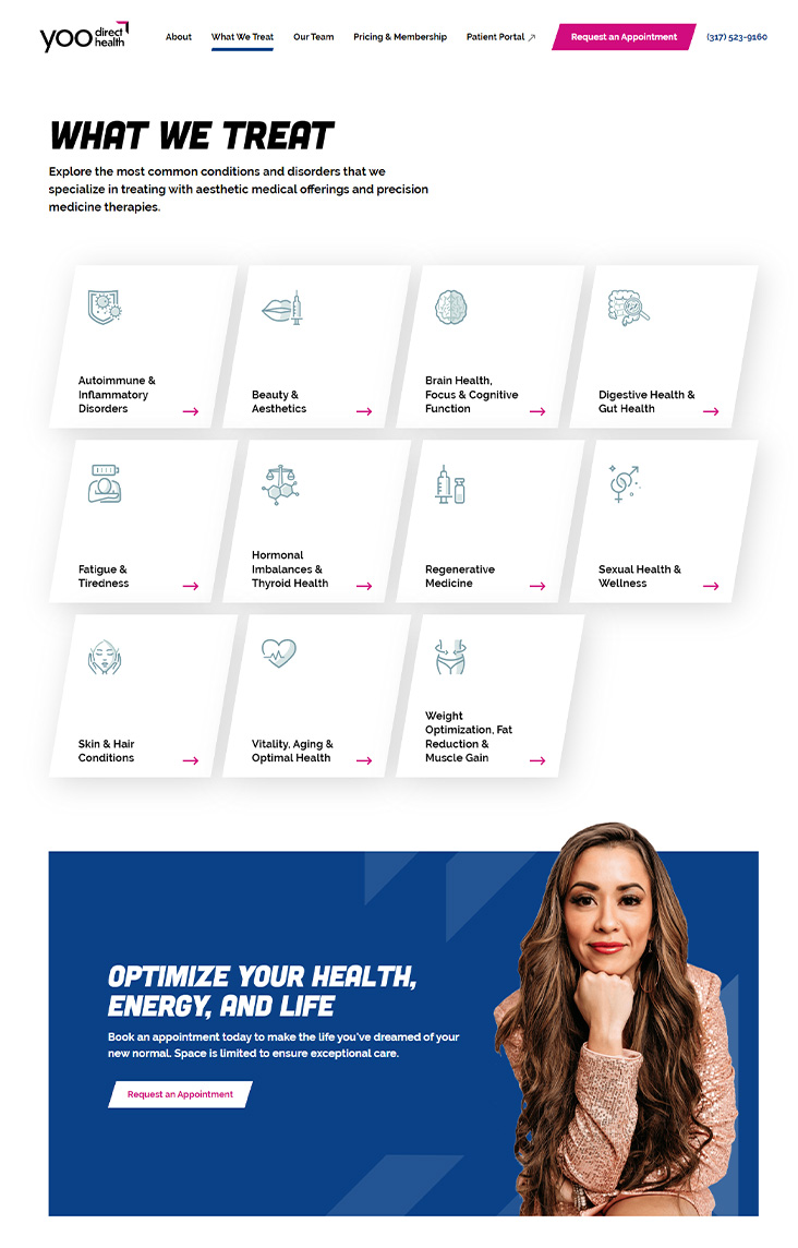
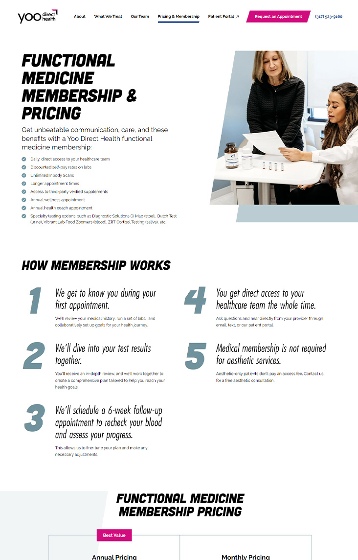
TBH Creative sought to convey the practice’s message and elevate its range of services through a fresh perspective. With a new approach to discussing problems prior to presenting treatments, the website discusses Yoo’s services at the patient level. The reworked navigation directs users to stronger content, enhanced conversion opportunities, and numerous educational opportunities for their patients. Given the 70% mobile audience, responsive design was critical to ensure a seamless user experience and the ability to reach patients anywhere.
TBH Creative developed a phased content plan for Yoo Direct Health to improve search engine optimization. Phase 1 included new content pages for each service line and structured for podcast and blog content. Phase 2 mapped out sub-level service pages that included treatments and other interest topics. Enhanced storytelling opportunities were introduced throughout the site, using patient testimonials and videos along with a podcast hub, to educate and resonate with new patients.


How do you make a brand stand out in an oversaturated industry?
Challenge—
Yoo Direct Health branding did not accurately represent them and did not differentiate them from the competition.
The muted color scheme failed to convey the innovation and vibrancy synonymous with the company’s reputation. The execution was sloppy and inconsistent, unlike their care and services. The logo did not work well in certain applications, often the company name was too small and light colored to read.
Solution—
TBH Creative re-established Yoo Direct Health’s brand messaging, expertise, and key differentiators. Our process included learning everything about Yoo Direct Health’s ideal audience, defining where they want to be in the market space, and conducting a competitive analysis to reposition the brand identity. With the help of word mapping, we established Yoo Direct Health’s desired perception, and created a new brand that embodies their bold and innovative ethos.
A new logo was designed to stand out with variations to work well across any asset. A fresh color palette was selected as well as bold fonts to represent the company. Custom icons were designed and usage rules documented in their first brand book.
2024 Silver Aster Award Winner