Digital marketing for orthopedic practice


How do you demonstrate market leadership on a website?
Challenge–
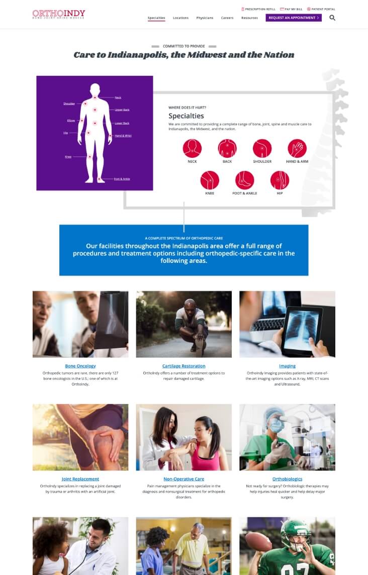
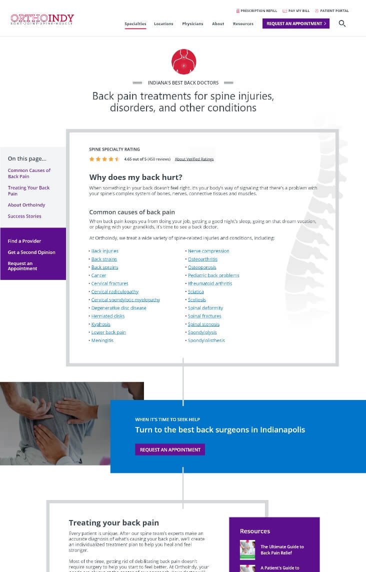
When OrthoIndy reached out to us for help with their website, they were in trouble. Their website had been recently redesigned, yet it was unfinished by the partner they selected. The site’s search functionality was broken, and its navigation was loaded with complex medical jargon, making wayfinding nearly impossible. On top of that, its design was lackluster.
Knowing that their site was in bad shape (not to mention costing the practice in terms of brand reputation and leads daily), TBH Creative set forth to execute a completely new design and structure.
Solution—
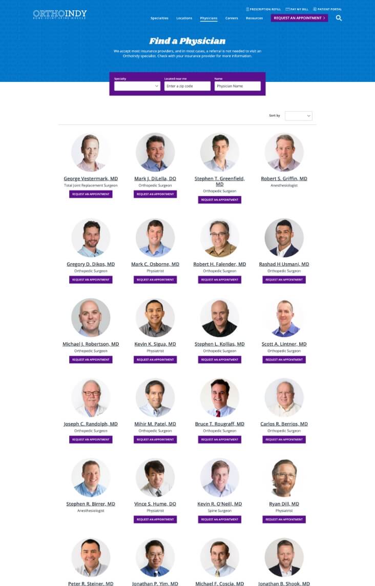
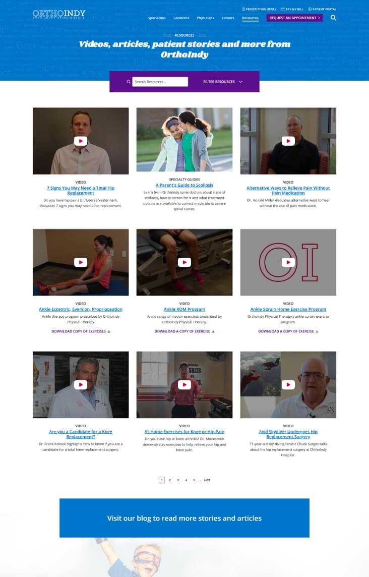
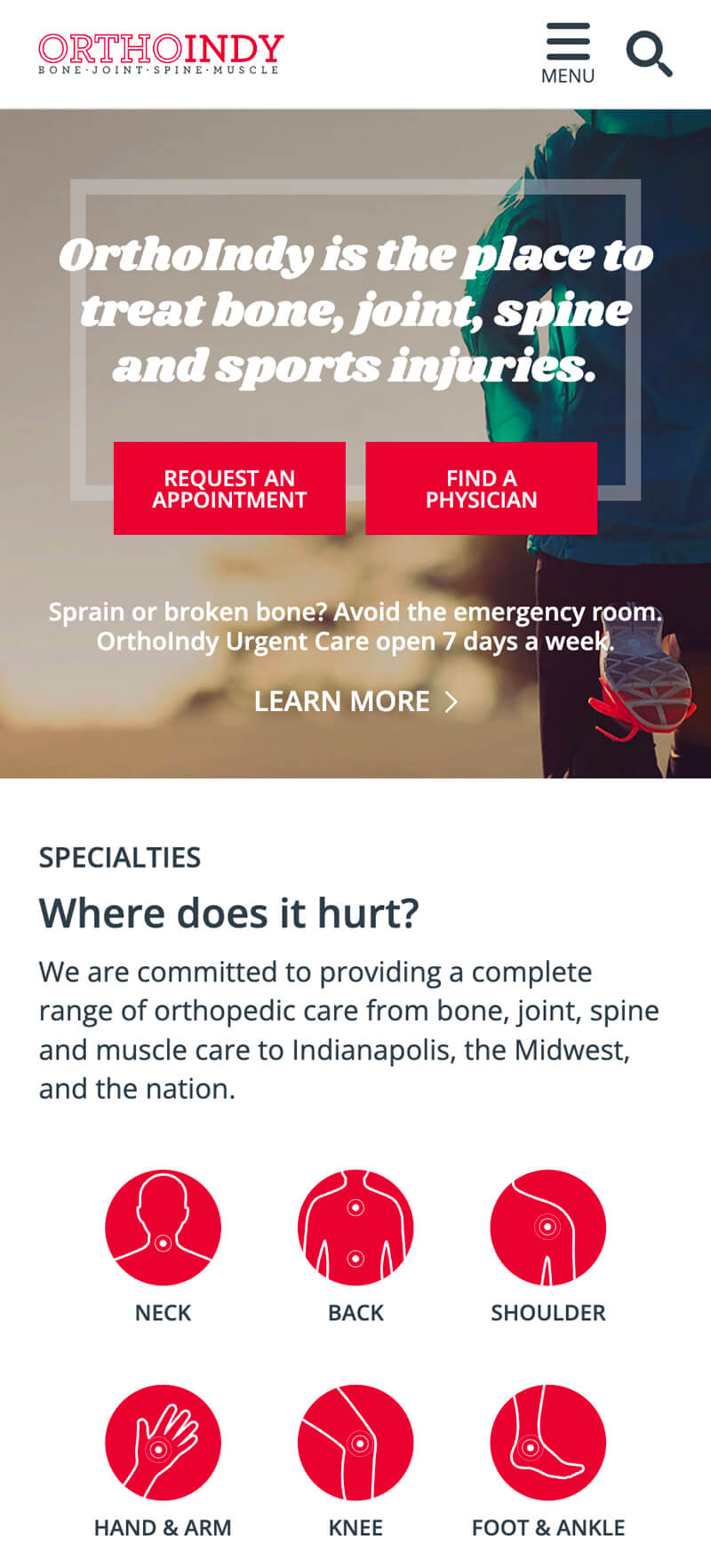
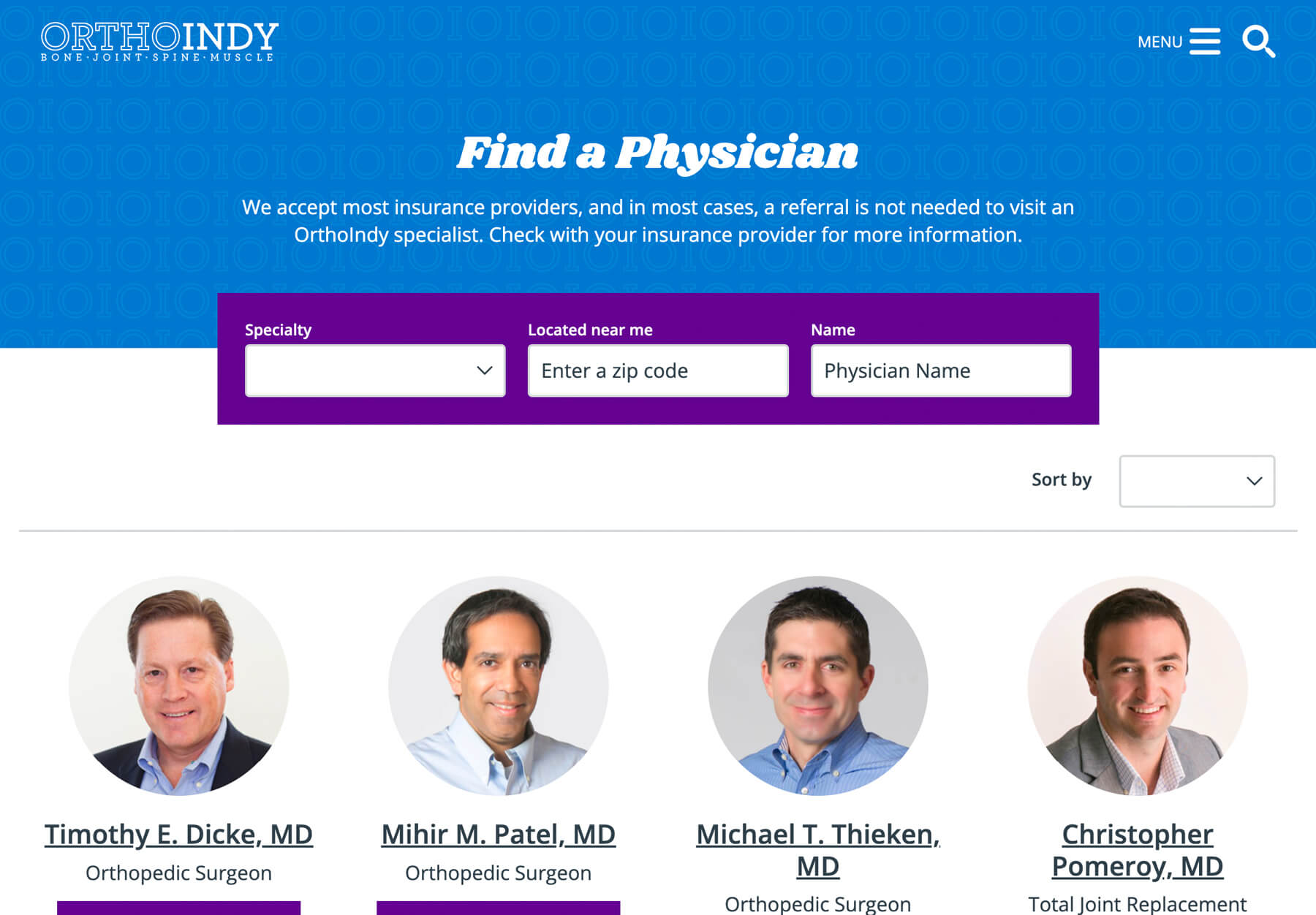
TBH Creative’s work on the project included restructuring the architecture to use more patient-centered labeling in the navigation. We also created an entirely new site design and introduced a palette of vibrant colors to their visual identity, chosen specifically to help get the attention of their target audience. Additionally, we built new functionality for the site’s location listings, physician directory, and resources.
Results—
- Launched project on time and on budget
- ↑ 80% appointment request increase within 90 days after website launch
- Gold Aster Award (Healthcare Blog)
How do you stand out in a crowded market?
Challenge–
OrthoIndy provides many services, including exceptional cutting-edge spine care. Although widely known as the place to go for joint pain and sports injuries, many people in the community weren’t aware that back care was also one of OrthoIndy’s areas of expertise. And, it didn’t help that the amount of local competition—including practices with the word “spine” in their names—was rising.
To improve brand awareness, OrthoIndy needed an integrated campaign to reach patients needing back surgery. The success measure of this campaign wasn’t just increasing recognition but also growing trackable surgeries from marketing initiatives by 50%.
Solution–
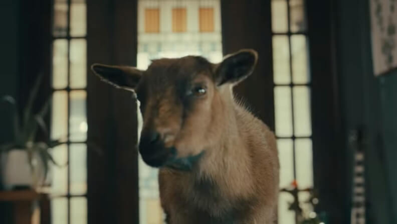
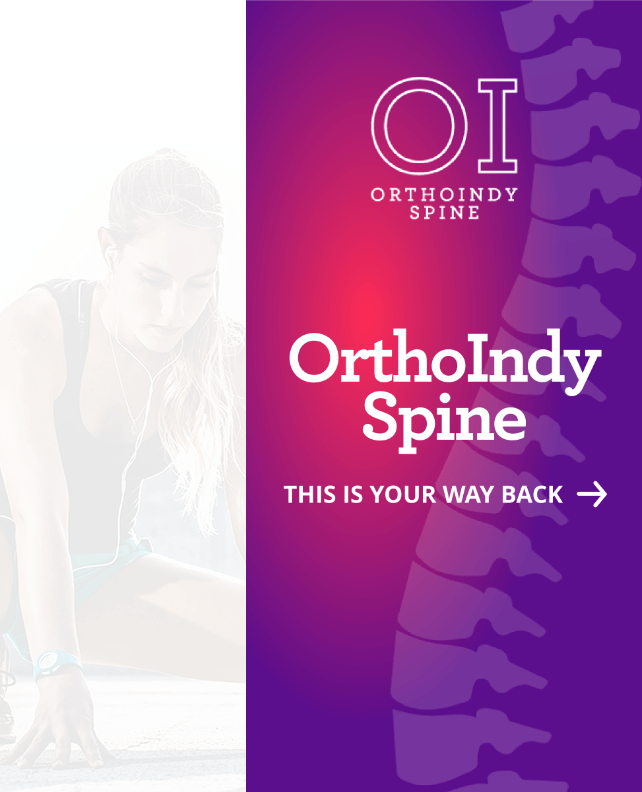
TBH Creative researched the competition, talked to patients, and interviewed providers and stakeholders. Since it was essential to stand out, the theme “this is your way back” was created. While other practices promoted their campaigns with doctor-centric visuals and messages, we wanted to speak straight to the audience. The goal was to poke fun at some of the crazy (yet common) things that people with back pain might do to find relief—like mustard baths and goat yoga sessions—before seeing a physician.
In addition to preparing the campaign theme, TBH also developed other supportive paid advertising campaigns to reach bottom-funnel surgery patients and created different touchpoints for those patients who need more nurturing before making appointments.
Services
- Brand/theme/messaging
- Reporting and conversion tracking
- Paid advertising strategies
- Commercial concept and art direction
- Inbound campaign (Minimally Invasive Spine Surgery) – 2022 Gold Aster Award
- Radio
- Print collateral




How do you help patients and earn their trust?
Challenge–
It’s not uncommon for people to live with discomfort for a long time, hoping their aches will disappear. These potential patients often search for alternatives to surgery during their long “consideration” timeline before making an appointment with a specialist. Knowing this behavior is typical, our marketing efforts focused on producing campaign assets designed to build trust.
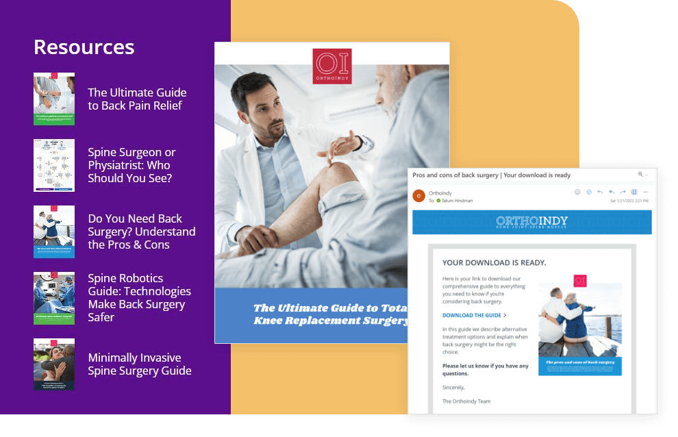
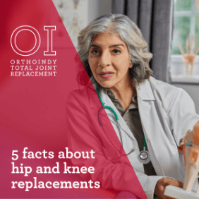
TBH Creative helped develop OrthoIndy’s robust collection of nurturing content guides, workflows, and marketing automation to support these potential patients and boost awareness.





Solution–
Over several years, TBH Creative helped OrthoIndy construct a library of digital educational resources (e.g., blog articles, pillar page guides, automated emails, infographics, checklists, worksheets, and more). Each campaign and asset was created to help the patient and build authority for OrthoIndy.
