Small hospital digital marketing



How do you make a website feel like home?
Challenge—
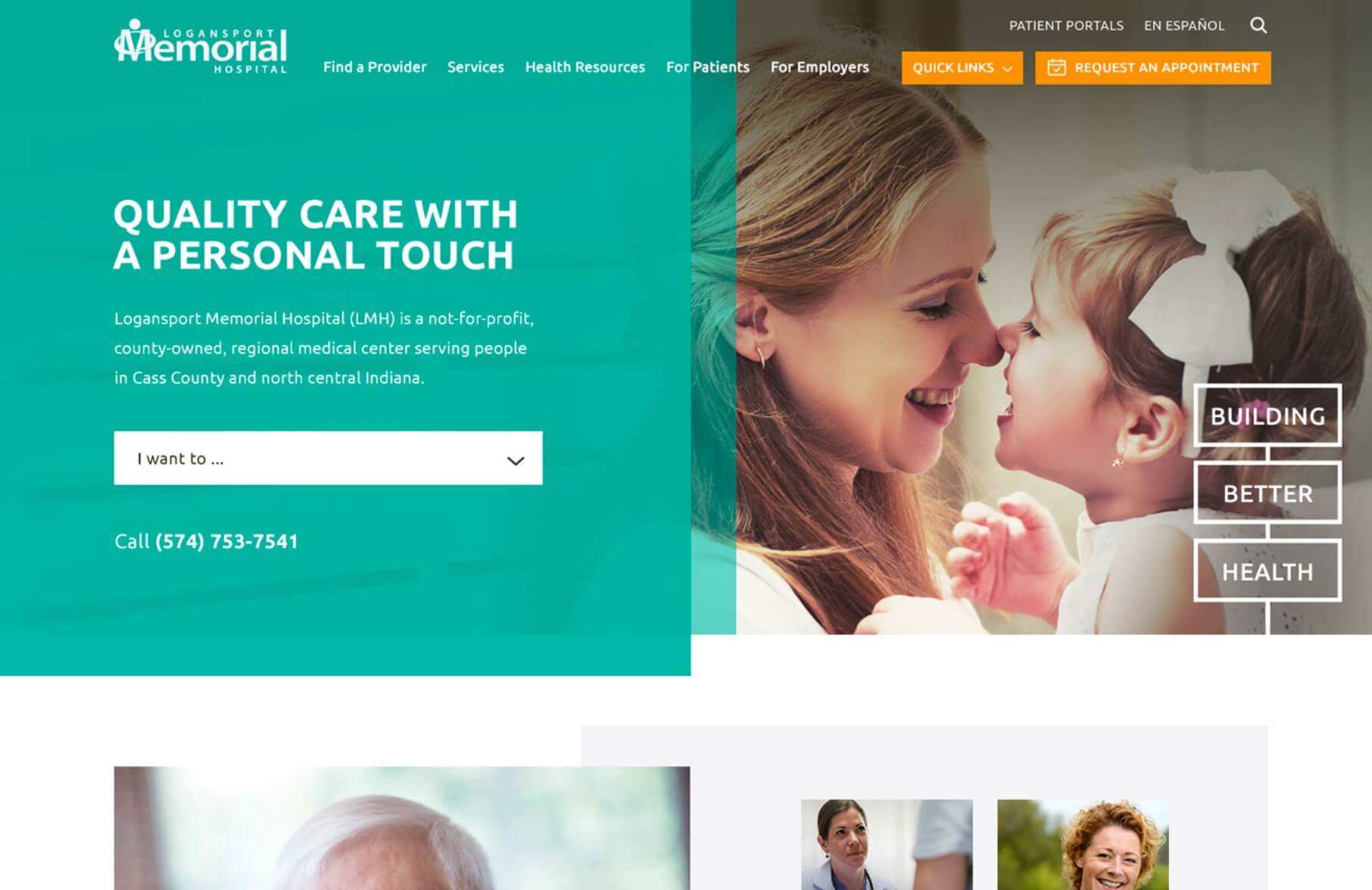
The community may be rural, but the website needed to match the brand message and contradict any negative comments. The website before redesign was amateur. A full new site was needed.
At the start of our healthcare marketing partnership, the hospital’s in-house marketing team expressed interest in developing a professional and polished online presence that accurately conveyed its brand message and countered any negative perceptions in the community. Working closely with LMH, TBH Creative created a modern and engaging website that reflects the hospital’s commitment to excellence.
Solution—
To create a new online presence that accurately conveyed LMH’s brand message and strengths, TBH Creative implemented a range of key components, including:
- Reorganized website structure
- Customized content creation
- Visually stunning design
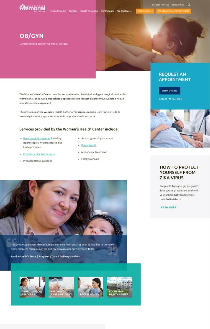
- User-friendly physician directory
- Robust provider profiles
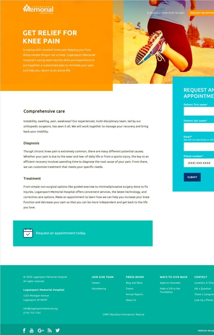
- Quick online appointment requests
- Interlinked information across pages
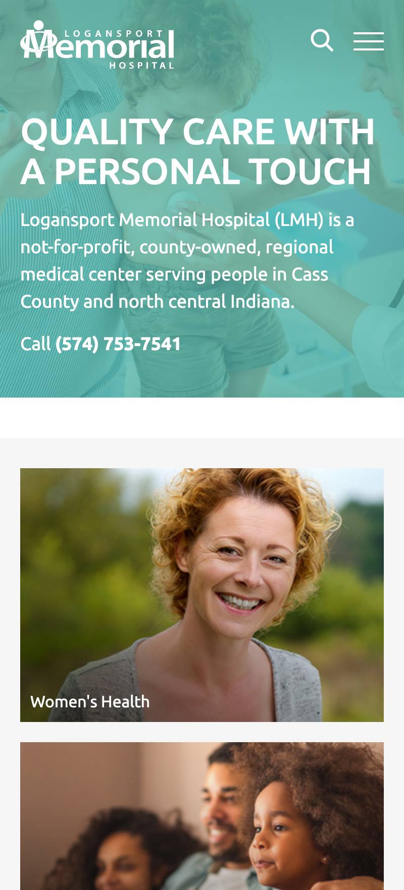
In creating LMH’s new website, we made accessibility a top priority, designing the hospital’s site to be user-friendly for all patients and stakeholders. We also provide regular reporting and make ongoing annual improvements that align with healthcare organization’s evolving needs and industry standards.

How do you help a regional hospital grow?
Challenge—
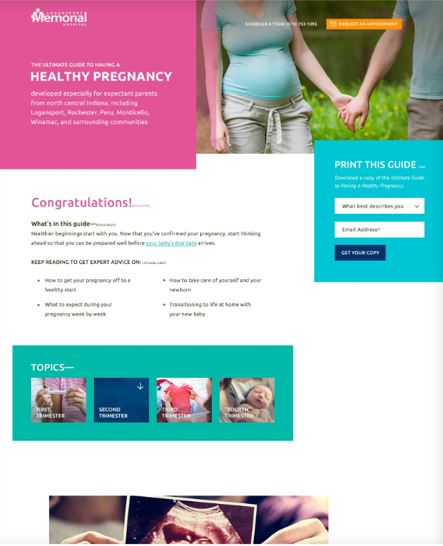
At the start of our partnership with Logansport Memorial Hospital, they were upfront about addressing their reputation with the community. Despite being known as a “band-aid station,” the hospital had ambitious plans for growth and improvement. To help them achieve these goals, we worked closely with LMH’s in-house marketing team to develop a digital brand that supported this vision. By collaborating on business solutions and enhancing its online presence, we were able to help LMH repair its reputation and connect with its community in more meaningful ways.
Solution—
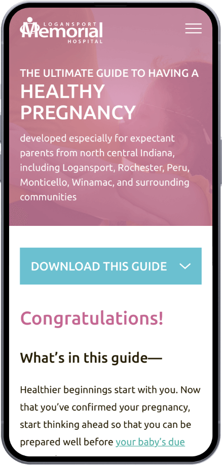
At the outset of our partnership, it became clear that the best results would require a long-term strategic plan supported by various healthcare marketing initiatives designed to help LMH achieve its growth objectives. While all of the goals of this partnership are too much to include on a single webpage, the following areas are among the most noteworthy:
- Amplify existing strengths to showcase LMH’s competitive advantages
- Bolster the digital infrastructure to align with business objectives
- Develop a library of helpful content to build trust and authority
- Identify community needs and incorporate those messages into the plan
- Create a high-end website that aligns with LMH’s improved brand identity
- Establish reporting mechanisms to track and evaluate the effectiveness of marketing efforts




How do you tell the stories of successful patient outcomes?
Challenge—
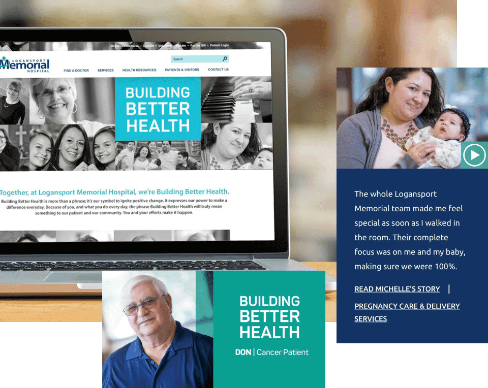
In a tight-knit community, a single negative experience can quickly spread through word-of-mouth and harm a healthcare organization’s reputation. LMH’s in-house marketing team understood the need to rebuild trust and credibility with patients (and the broader community in north-central Indiana). They collaborated with us to promote patient success stories as a powerful testament to the hospital’s commitment to compassionate care. Through these stories, we could demonstrate the hospital’s dedication to excellence and earn referrals from satisfied patients.
Solution—
While positive patient experiences were happening daily at LMH, we realized that a more proactive approach was necessary to showcase these stories. Using the website to highlight several patients’ unique needs and the outcomes of their experiences, we created engaging and informative digital content that resonated with the community. Storytelling emerged as a powerful healthcare marketing solution, allowing us to connect with patients on a deeper level and demonstrate LMH’s commitment to delivering exceptional care.
How do you find and recruit talent to a rural health system?
Challenge—
Attracting and retaining talent is a major challenge in today’s competitive healthcare landscape. According to the AAMC, the U.S. is projected to experience a shortage of up to 139,000 physicians by 2033. For small rural healthcare systems like LMH, the need to grow their care and stay competitive is more pressing than ever.
Solution—
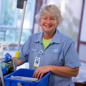
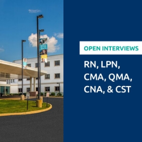
TBH Creative’s strategy for supporting recruitment efforts began by showcasing the unique benefits of living and working in Logansport on the hospital’s website. We tailored this content to appeal to both healthcare providers and support staff positions, using best practices to create compelling job listings and descriptions. To ensure that open positions reached the most viable candidates, we also developed and executed targeted advertising campaigns to reach qualified individuals.

